Ovalware Design Language
Ovalware • 2024
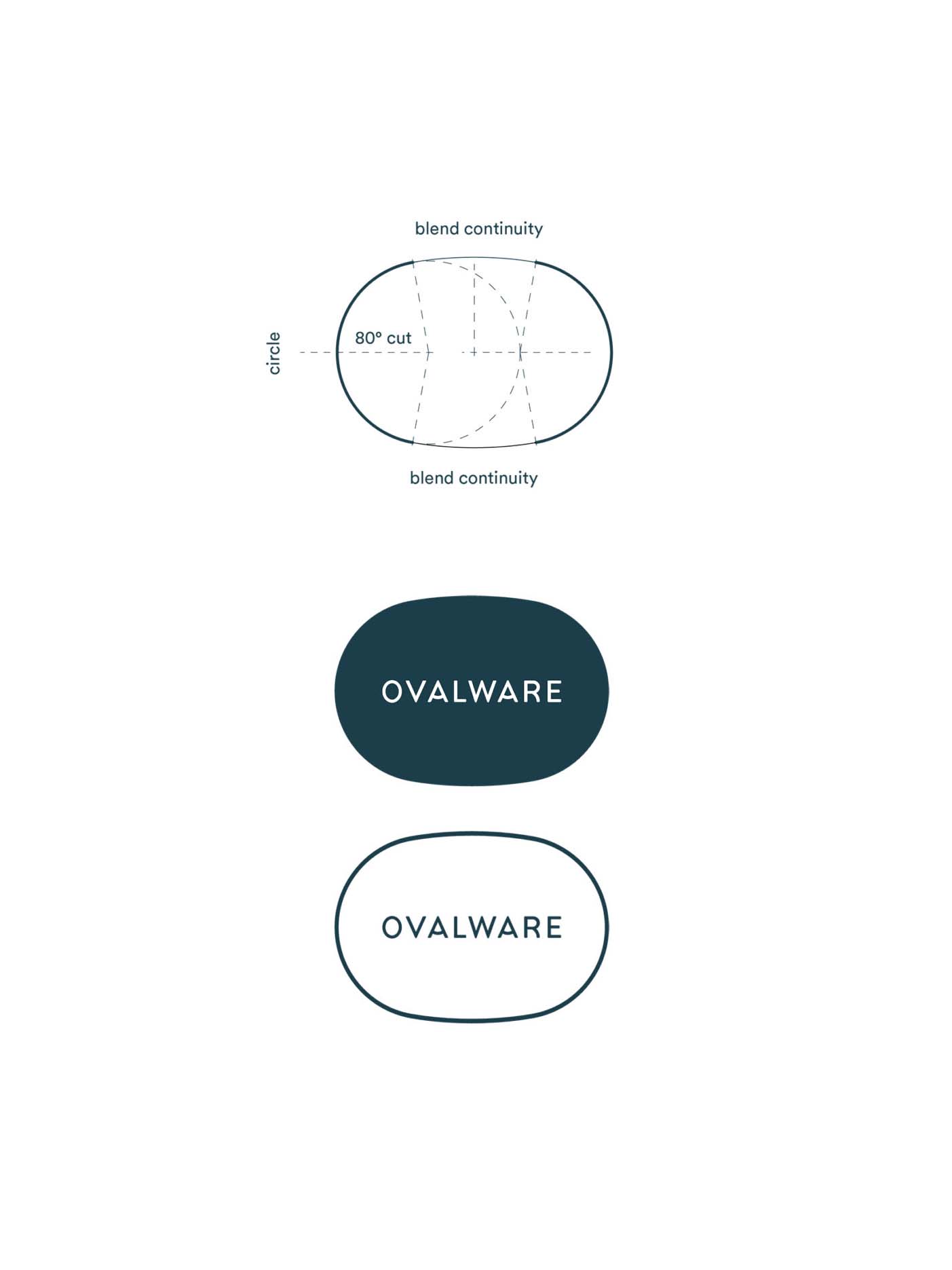
Unified oval element across the entire brand, which stems from the brand name
Brief
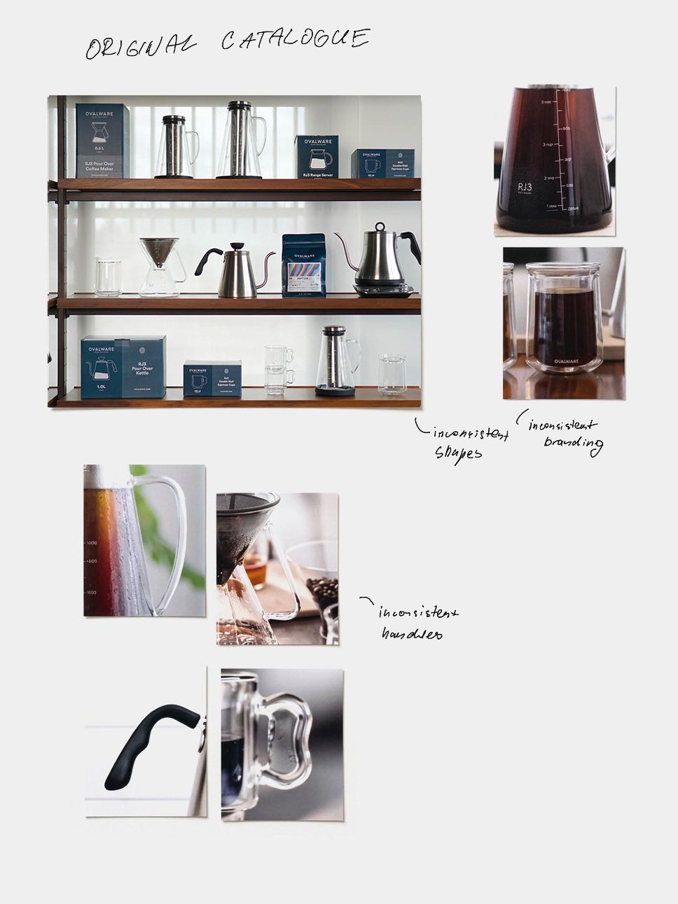
Before continuing to expand the Ovalware portfolio, we started with one question: what is characteristic about Ovalware products? The original catalogue had grown product by product. The shapes differed from one product to the next, the branding was applied inconsistently, and the handles on the kettle, the server and the cups each followed their own logic. To keep growing, the brand needed a direction that the next products could build on.
Solution
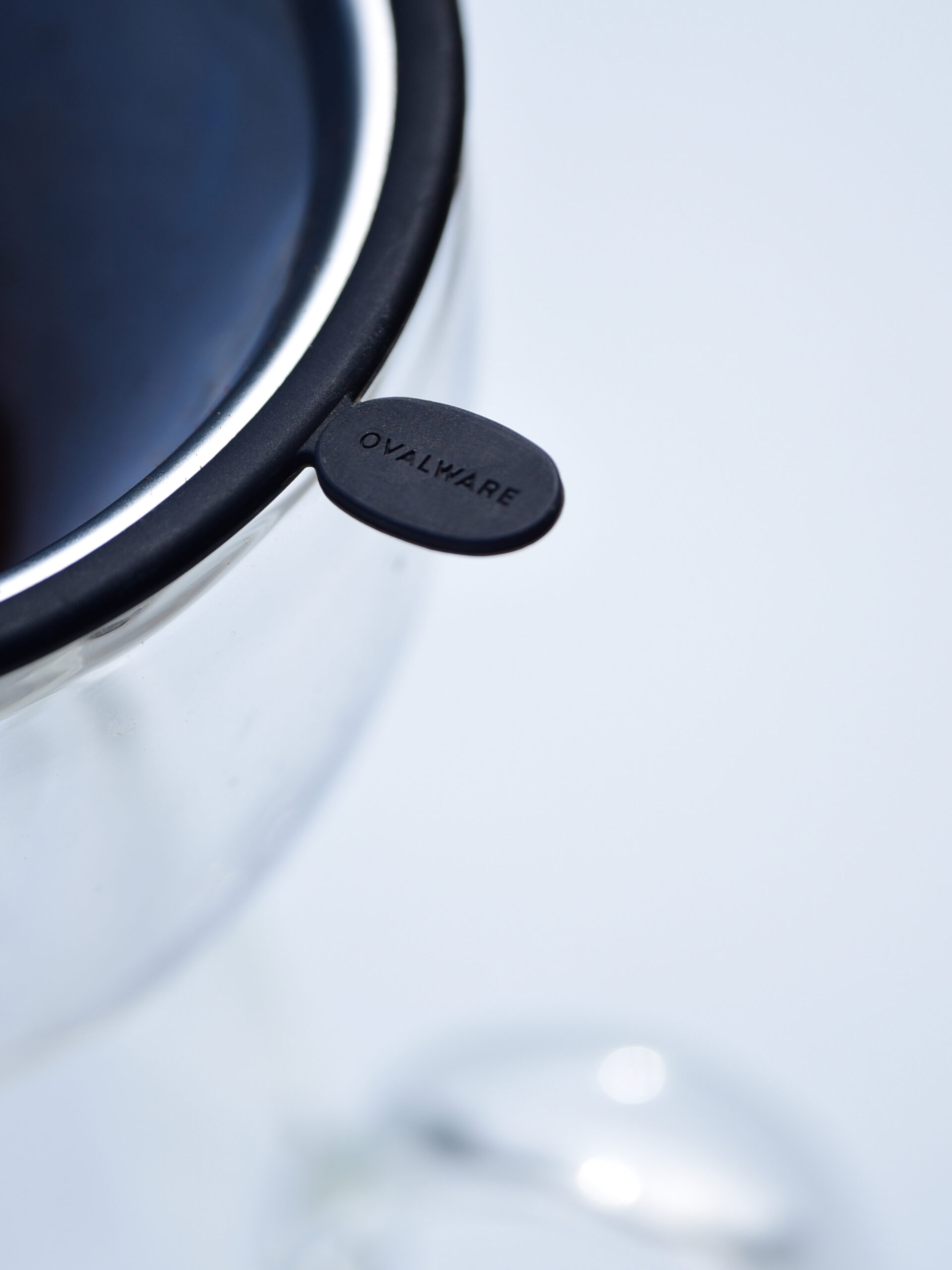
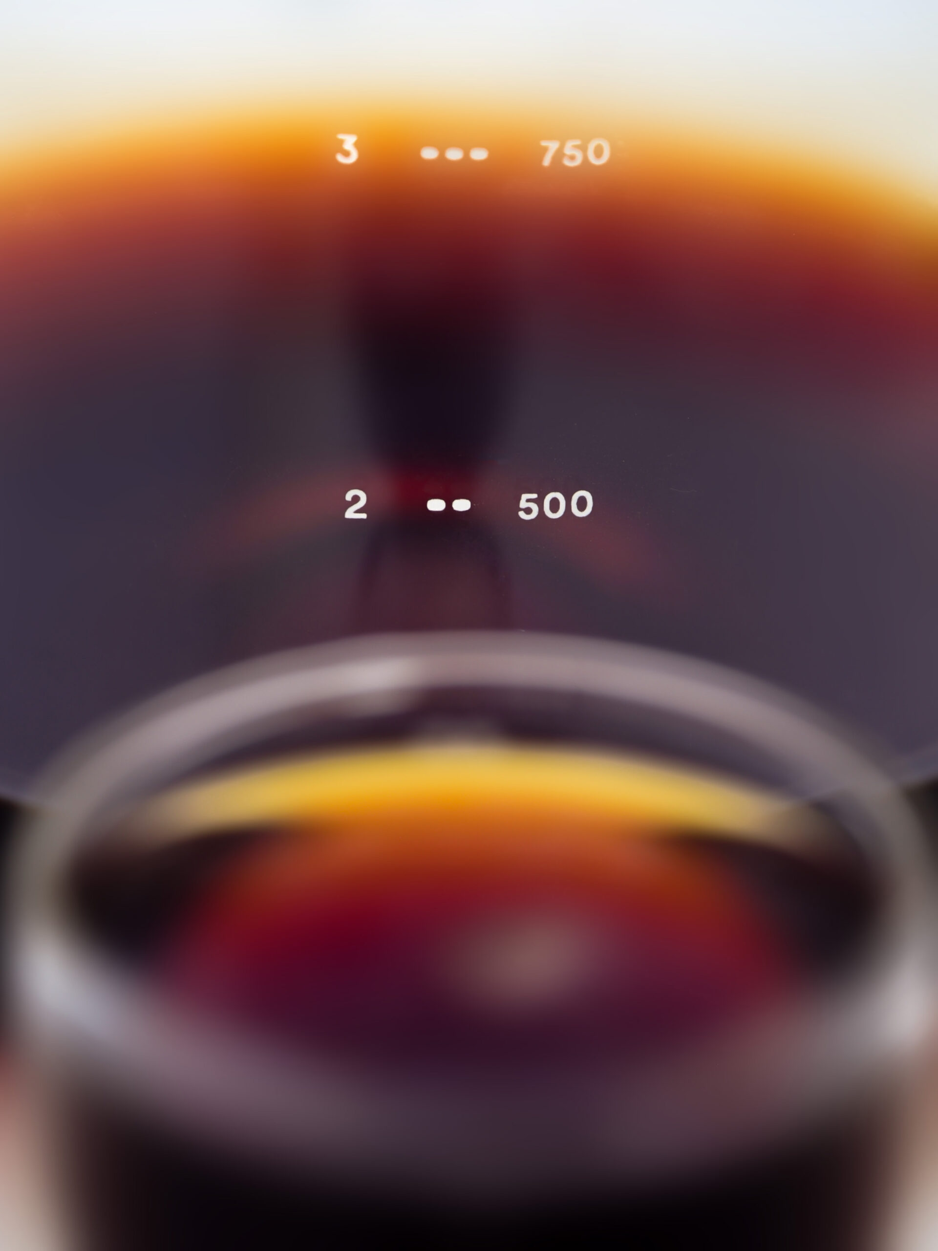
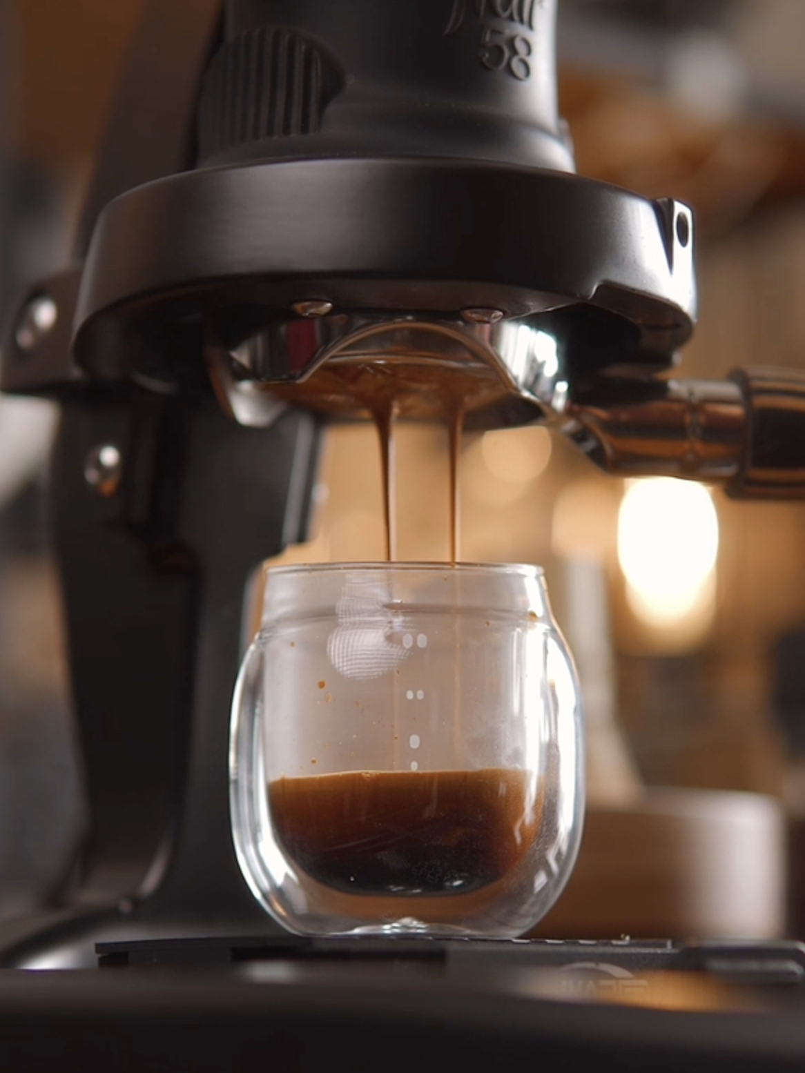
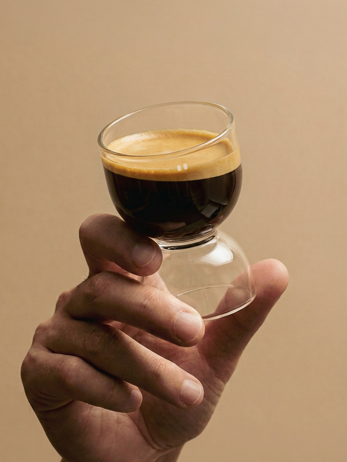
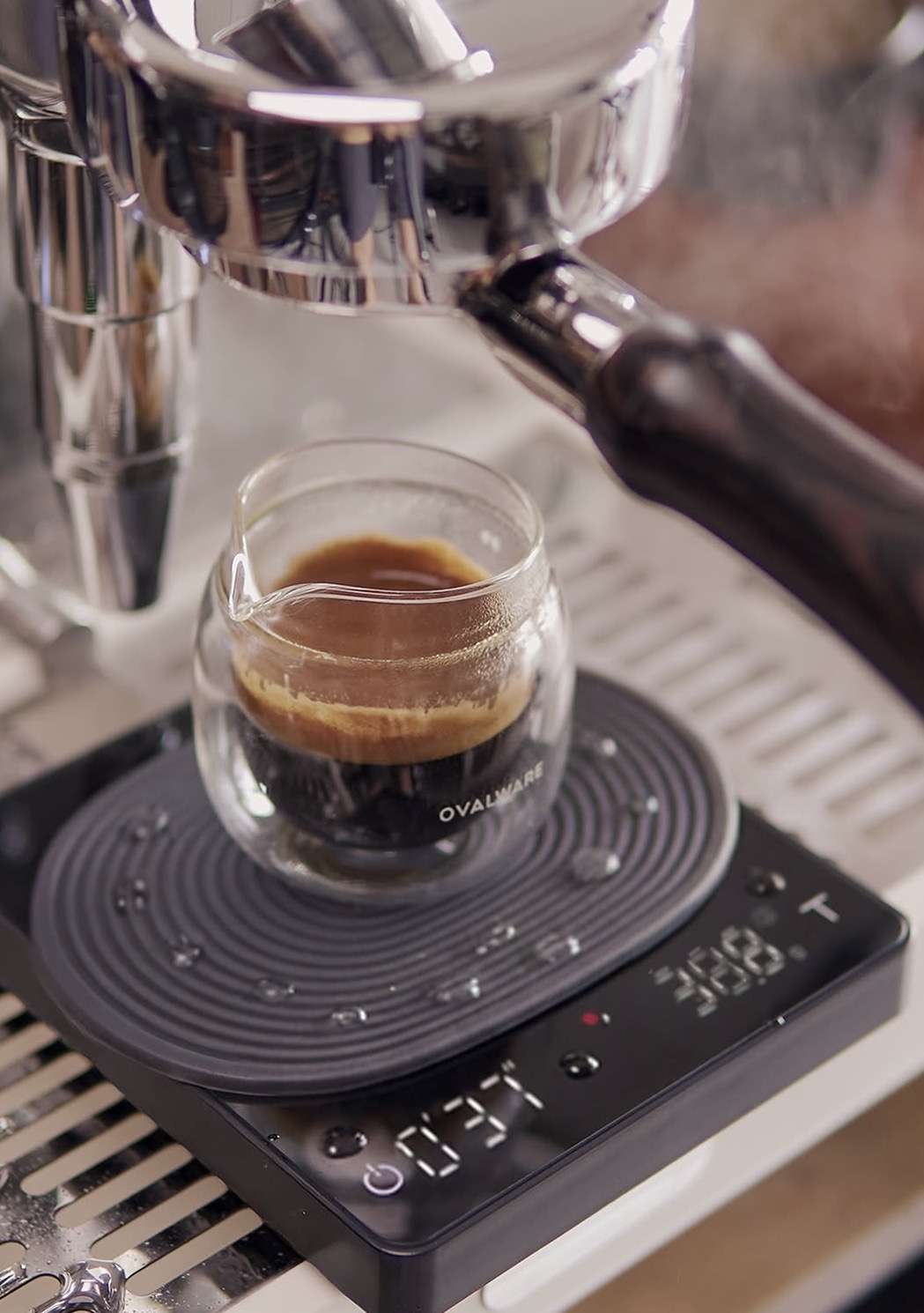
The answer was already in the name. We made the oval the unified element of the whole brand, from the logo to the products. The forms are round and soft: the carafes are built from stacked and joined ovals, the double-wall cups have a gently curved rim, and the oval returns in the logo, in the cup and level markers and on the packaging. The language is now set for the products that follow.
For the entire brand, we come up with a funny name connection, where the word oval helps create a characteristic language across the brand, where its products are round and soft.
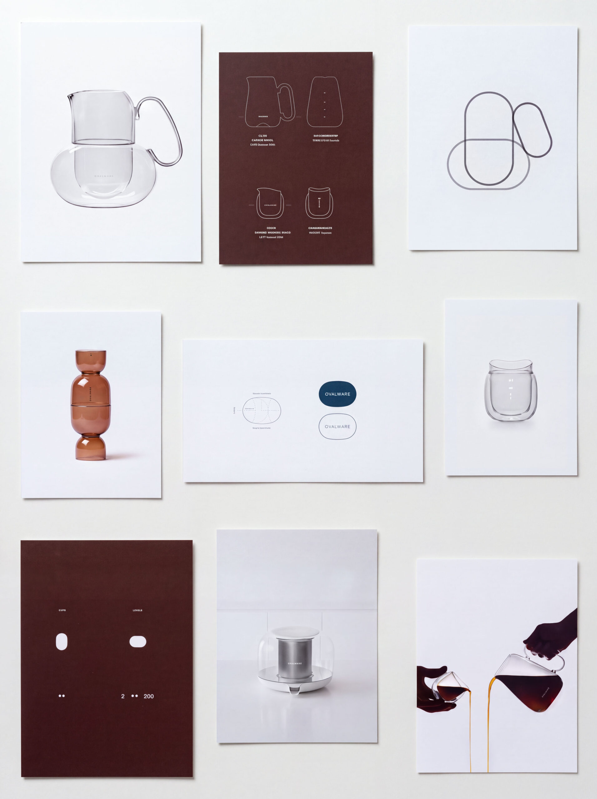


Designer oval – two circles cut at an angle of 80 degrees so that the connection between them is not a straight line, but a continuous connecting line.